A Future Imagines
Monday, January 24th, 2011Syd Mead discusses imagination and the future.
Thanks Jago.
[vimeo]http://vimeo.com/17376932[/vimeo]
Produced by Flat12.
Syd Mead discusses imagination and the future.
Thanks Jago.
[vimeo]http://vimeo.com/17376932[/vimeo]
Produced by Flat12.
www.ltrhds.com
![]() Half a lifetime of 16-Bit video games, anime, fantasy art and prog rock, these are the elements that sit on the surface of James Greenaways work, but so much more lies just underneath and it’s this that has developed Jagi’s cult following over the last decade.
Half a lifetime of 16-Bit video games, anime, fantasy art and prog rock, these are the elements that sit on the surface of James Greenaways work, but so much more lies just underneath and it’s this that has developed Jagi’s cult following over the last decade.
James Greenaway first came to notice through the surreal promotional material he created for the his underground breakbeat and jungle parties, in the successive years he has developed into one of Melbourne’s most sophisticated emerging artists.
For more information check www.jagiart.com
Jagi’s artwork is based on the letter Q.


.
Your intricate landscapes remind me a little of old platform computer games. What sort of influence has gaming had over your work?
An enormous influence I would say. I spent most of my childhood sitting in front of the television playing Sega consoles. When Sonic the Hedgehog arrived in the early nineties, I remember how hypnotized I was by the blurring intricate landscapes as I watched the demo in numerous shop windows run though the first few levels.
Later I would come to understand the true sophistication of the design of the early Sonic games and how influenced by art deco design they were.
Having said that, when I look through old drawings I made when I was under the age of ten, the majority of them are landscapes from fictional video games I would imagine.
My first friend at school had a Commodore Amiga and I believe it triggered something in my imagination at a very early age. Even to this day I have a profound adoration of all imagery that came from the early decades of video gaming, everything from inappropriate box designs to extremely low-res and low-colour pixel art.

.
I’ll bet your Amiga friend had a copy of Shadow of the Beast.
Hmmm, I can’t remember… I do know that I soon got my own Amiga and I had a copy of Shadow of the Beast II, which was similar to the first installment, but had a darker, stronger atmosphere and more consistent graphics.
But yes, I’m familiar with the Shadow of the Beast series and their fantastic style and production values..
Incredible sound tracks too by David Whittaker and Tim Wright.

The worlds you create are ruled by fantastic feudal warriors and overlords. Do you flesh out each character’s full personality and background story in your head? Is there a mythic Jagi master narrative that envelops your creative terrain?
Interesting question. I wouldn’t say I flesh out ‘each’ characters full personality, or even at all.
When I design a character I want him/her to remind me of classic archetypes from old school manga and video games, such as the unwilling young hero, the nomadic bad-ass lone wolf character, the wise old mentor who is always touching up girls, the evil villain’s right hand man who near the climax of the story realizes the error of his ways and turns on the evil master, the evil master, the adorable flying furry turtle who turns out to be the last survivor of an ancient race of omnipotent god breeders…
 Yeah anyway..
So basically the ideas attached to any given character are loose but are profoundly awesome. I have come up with several ideas for story lines that could be good for films or video games, but that is usually a separate creative process to drawing and making art.
And yes there is a mythic Jagi master in this world. He is a shape-shifter and appears in different forms from picture to picture.
You can never be one hundred percent certain who he is, but generally he is depicted with some kind of godly power of creation over the landscape and creatures in the illustration.
.
.
 Jagi-Land seems like quite a hedonistic realm. Is it an escape from the uptight anxieties that govern life on the real world? Or are there darker currents running through your work?
Yes I’d say it is an escape. Not just from anxieties of the real world but also from boredom with it.
I often day dream while I’m out and about and wonder why things cant be more interesting then they are. I’ve lived a very sheltered life and felt very out of place throughout most of it, so these landscapes are just depictions of the way I wish people and places could really be.
I don’t think there’s anything too dark in my artwork.. Sex and violence sure, but those aren’t enough to truly disturb people anymore.


You strike me as the sort of guy who just drew endlessly as a kid…Your penmanship is remarkably fine and precise. Have you given much thought to exploring other mediums? Can you imagine your characters somehow leaping out beyond the gallery frame?
Hehehe thanks. Yeah I’ve given thought to some other mediums.. Would love to do sculptures and figurines one day, but my main priority at the moment is in developing video games.
Although it involves the same techniques that I usually use for art (digital illustration), I think it’s a medium for storytelling and entertainment that is more powerful than film, music, or art, for the reason that it can incorporate all of the above into an experience like no other.
At the moment I have a storm of game ideas thundering around inside my head and I’m working towards making those dreams a reality and starting my own video game studio.
With any luck I will have a playable demo of a video game on display at my next exhibition.


Is there anything you want to know about spray paint history, brands, charts, collections and much more ?
So go check out the Cap Matches Color website for everything there ever was to know about spray paint!

There you´ll find cool ads like these ones

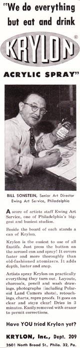

Plus interviews with graffiti writers from back then, like Sen One and others, telling their racking stories, the best and worst spray paints and painting experiences, with awesome photos from the old school.
 In this photo, Sen and his IBM CREW :SHOOT, PEL (RIP), SEN-1, POZE, POKE, WEST, LONE, NEL (RIP), ECO.
They also accept contributions of photos,artworks and interviews from old school writers, so if you were there share the history!
Even Martha Cooper contributed (which is how I found out about the site in the first place), after all that´s all she ever did to the graffiti and hip hop culture !
 Dondi’s hand spraying a Krylon’s can.

You got to learn where you came from to know where you going !
Here’s the Jago interview.
for the rest check. www.ltrhds.com/blog
![]()
Bristol Based Mr Jago, a pioneer of the doodle, founder member of Scrawl Collective and a veteran in the street art movement and much respected among his peers.
Growing up in a small town, Jagos interests in art and design with influences from classic Marvel comics, graffiti and hip-hop culture have help forge his unique freehand style and distinct colour palette.
Jago has worked with some of the biggest international brands such as Nike, Puma, Xbox, Yohji Yamamoto & Boxfresh to name a few.
Mr. Jago joins the LTRHDS exhibition with his reinterpretation of the letter J
.
 .
.
 You’ve mentioned how your new works feature latent characters battling against the landscape that subsumes them. What does this struggle for definition represent? Is there a reason why your figures so overwhelmed and obscured by their surrounds?
The figures are meant to represent us and our doings. I imagine our cities, pipes and power lines sprawling into the landscape like a giant alien parasite in a science fiction movie.
A synthetic entity gorging itself and expanding, with no Godzilla to slap it and tell it to bugger off back to its own planet. The battle in my recent pieces is me playing with the conflict between man and nature… looming figures scour their way across the landscape like storm clouds leaving destruction & noxious gases in their path.
.
.
.
 Your fantastic landscapes look like giant gassy nebula clouds… even though you have moved away from your anime-inspired art, tell us about the way that science fiction continues to inform your abstract style.
It seems that in the space of my short lifespan a lot of what was science fiction has already become science fact.
We are constantly bombarded with the evidence of our impact on the environment, so the worlds I imagine in my work could be our own. A common landscape in science fiction (old and new) is a planet sapped of all its resources, a toxic and hostile environment in which mankind is left to scratch out an existence.
The clouds in my paintings are the imagined fallout from the damage done but like oil and fossils the clouds could also be us.
..
..
You seem to be  working a lot with triptychs lately – why this choice? Has the sprawling nature of your work been a gradual development or did you make a conscious choice to start painting on a larger scale?
The triptychs came about simply from me switching from canvas to paper. After several frustrating attempts at fitting my marks within the dimensions of a single sheet I chose to adopt the same attitude
I would when approaching a wall piece: simply by spreading out and adding more paper, I gave myself more space to work within, and this ended up leading to a slightly more panoramic look to my landscapes.
.
 Working in a call center did you ever think you weren’t going to make it as an artist? How close did you come to throwing it all in, and what kept you going?
I think if anything it was the call centers that lead to me having a career. The longer I spent in them the more it became apparent that I would lose my soul (and my marbles) if I stayed in that line of work.
There was no time to talk to your fellow ‘slaves’ and not much fun to be had either, so the only tactic to stay sane was to draw. I worked with my friend Will Barras, and we would pass doodles back and forth to try and make each other laugh, often ending calls prematurely!
This went on for a while until Will made the leap and got out to pursue his career in illustration.
Before long I took Will’s lead and used my evenings to scan drawings onto my Mac at home and then colour them up; and after shopping them around to record labels and magazines with little success, my big break came when Ric Blackshaw saw some flyers I’d been doing for club nights in Bristol.
He included some of these designs in the first Scrawl book. Before long Ric was getting enquiries about my work from some pretty big clients. It was the confidence boost I needed to leave the ‘battery farm’ vowing never to return. When things are tight the memory of my time in the call centers helps to keep things in perspective.
..
 Was Rolf Harris really one of your earliest artistic influences?
I grew up with Rolf’s happiness on the TV. It was his large scale speed paintings that I admired the most.
At school I was told I was good at art but like most children wasn’t very confident with someone looking over my shoulder as I worked. Rolf just got on with it. I loved the way he would bang on the colour not once appearing to worry that his painting could go wrong. He was the king!


![]() Many of you know Luca Ionescu as the designer and director of Like Minded Studios, whose ornate typographical aesthetic has blessed campaigns and designs for the likes of Nike, RVCA, Stussy, Zoo York and The Commonwealth Bank. Others might be more familiar with Luca, the art director and founder of Refill Magazine and the Refill projects.
Many of you know Luca Ionescu as the designer and director of Like Minded Studios, whose ornate typographical aesthetic has blessed campaigns and designs for the likes of Nike, RVCA, Stussy, Zoo York and The Commonwealth Bank. Others might be more familiar with Luca, the art director and founder of Refill Magazine and the Refill projects.
Either way you look at it, Luca is amongst Australia’s most contribution citizens for the art and design, so we’re happy to bring you this mini interview as part of the build up to the LTRHD exhibition.
Luca will be doing the letter “L”.
Like Minded Studio.

.

Do you think there comes a point at which individual style becomes counterproductive to the objectives of good design?
I think a designer/typographer should be able to see the difference between style and function and be able to combine or separate them as need be.
I think an artist or designer can use their own style within the advertising and design world as long as they can still answer the brief. I think personal style is key for an artist to establish and express themselves visually.
Any great artist that has been remembered throughout time developed an unique style, be it a musician, visual artist or designer. A designer working with clients is a different matter to being an artist.
As well as using their own style a designer must always be aware of the brief a client has given and the message they are trying to communicate and not let style get in the way.
You must master your ideas before you add style, style alone without substance does not function. Style alone can be reserved for pushing boundaries in experimental and personal work.
 Is the rise of the ‘rock star designer’ inspiring greater originality and risk-taking within the industry, or is it encouraging a type of repetitive, idiosyncratic self-branding that discourages innovation and discovery?
I think that what you are saying about the rock-star designer is not something new… he has been around for a while.
Sure there will be those who are caught up in the scene, ego and rock-star mentality. And then there are those who are the real rock stars that live their life by their art and design and continue to take risks and be original.
You could argue Paul Rand was a rock-star designer in his day, yet he was still a risk taker and original. Most of all I’m sure he was not on an ego trip about his greatness but did his own thing and others noticed his vision.. and he developed a style he could use within his work… and still be able to communicate ideas.
I think companies are definitely seeing the benefits of aligning themselves with artists to propel their brands and allowing artists to sign their work.
 Hopefully it’s the dawn of a new era or poster and advertising art where artists with unique and original styles are encouraged to sign their work and be able to blend style and visual communication.
This tradition of brands and artists has been happening from the days of Mucha, Piatti and A.M Cassandre.
What is the one campaign you have designed that you are most satisfied with?
The Tooheys 696 campaign was a great project to work on, that has snowballed into more work for Tooheys.
Is there a memorable instance where you think you were able to communicate something in a particularly acute and effective manner?
It happens all the time, especially when clients get our ideas.
Do you believe that ‘less is more’?
I believe there is an answer to every problem and each one is different.
 How do you think that audiences are responding to design in an era where technology has made it so dazzling elaborate?
I think there is a trend amongst designers to bring things back to doing things the old fashioned way, bringing the craft back.. not letting technology dictate but.. putting emphasis on traditional skills that would otherwise be lost.
Such as hand lettering and bespoke type. At the same time technology is offering us access to abundant information that was not accessible before, enriching our work.
 Are people becoming more numbingly apathetic towards the visual media that saturates them?
There is currently an over-saturation of blogs and social media devices that can become a distraction. Its up to the individual to choose how much they want to expose themselves to.
Do you have a role model that inspires and guides your output?
I would be limiting myself with just one role model, I like to keep learning and growing from everyone around me.
.
What does their life’s work represent to you?
Keep on moving and do as much as you can, and give back to others.
 What’s one piece of advice you would give to someone with aspirations of becoming a designer?
Learn to communicate well, don’t be afraid to express your ideas or of confrontation. Good design is communication, that will also help you when you draw up sketches… if you can become a good communicator you can flesh out your ideas without being afraid of making a mistake.
Take an interest in art and design and research and study on what has been done before your time, respect those who have done it… and go create your own.
Most of all enjoy what you do and share it with others so they can enjoy it also. Don’t be afraid of complementing others that are doing good work. Don’t get caught up in the scene, envy or hate.
These are things I would tell my own son if he asked me about being a designer.
.
.
Luca is part of LTRHDS exhibition, launching February 26th in Melbourne. Click here for more info.

Keep checking www.LTRHDS.com/blog for more interviews leading up to the LTRHDS show.
![]()
Born 1985 in Yokohama Japan. TwoOne’s interested in art was initiated by the famed but unfortunately recently buffed 2km graffiti wall of his home town. When Two arrived in Melbourne at the age of 18 he became involved in the Melbourne street art scene and has since developed into one of the cities most prominent artists, both on the street and in galleries with The One Thousand Can show in 2008.
Two is joining the LTRHDS show with his reinterpretation of the letter T.
TwoOne’s website. twooneelephant.com. More information about the one thousand can show click here.

 Last time we talked it was for your 1000 Cans show. Where has your art taken you in the meantime?
I have been involved with a few group shows. I had my second solo show So Far that included painting, sculpture, lino cut prints, and installation works in October 2009. And I have been working on a live performance project called Lo2’s Fleet with Melbourne legend mc ELF TRANZPORTER. I paint, cut wood, construct sculptures, and while doing it all I also make sound with the equipment that I use to make the visuals… So my art has taken me in lots of different directions.
 There is a dreamy, zen-like quality to your work. Where do you find the inspiration for your impish little world?
I used to get lots of inspiration from my dreams, but now I get more inspiration from everyday life. It’s the world everyone sees, but everyone sees it int heir own way. I like seeing the world as it is. No expectations, no sugar coating. I don’t particularly try to make my work zen or dreamy.
.

.
Your works are an oasis of peace and balance. Do you inhabit that same bubble? Does your art insulate you from the world and its worries, or does it represent a state of being that you are striving to reach?
I’m not creating work to escape from the wold. I guess I can maybe say it is representing a state that I’m striving to reach, because when I create I try to make something that I haven’t seen before. This process is like striving to reach the next state, and normally when I start a new project I don’t know what that next state looks like.
.
 .
.
Goldfish are a motif that keeps popping up in your work. Do you keep fish yourself? How important is your relationship with animals and nature to your work?
I don’t have fish myself, but animals and nature are very important to me, because that’s where all the life comes from. We can’t live with out them. At the same time I think that the relationship between nature and myself isn’t so important when it comes to creating. When I draw or paint them, I bring the canvas’ character out from them.
So it’s more of a relationship between canvas and nature. I think that’s because I have been working on wood a lot, wood seems to bring out more organic images in my head. I don’t know why that is or how it works. but that’s how I feel. And now I’m start to feel a soul in artificial things, stuff that’s human made.
They makes me want to do something with them. I imagine it’s more about where I channel my head… everything around you could become interesting and important.


 I’m guest arts editor for this months issue of ACCLAIM mag, featuring Dalek, Usugrow, Jagi and Dante Horoiwa.
One of the 26 interviews going up with uncanny regularity on the LTRHDS exhibition blog.
![]()
The 4th interview in the LTRHDS mini interview series is with New York typographic artists Greg Lamarche, who began writing graffiti in 81 as SP.One and working as a designer and artist since 2000.
Greg’s style reflects the fonts, lettering and graphical noise of the NYC street. Working with collages, bold colors and applying the aesthetic approach of graffiti and street signage to artwork Greg’s swirling lettering is both familiar and truly unique.
More artwork and info on Greg Lamarches’ site.

.

Was your move away from being SP.One partly due to a feeling of dissatisfaction of boredom with what graffiti has become? Is it still the progressive medium it once was? Or had the time just come for you to do something fresh and new?
SP is only one aspect of what I do and branding my tag was never something I really wanted to do. I am a purist when it comes to graffiti. For me graffiti is in the streets, highways, tunnels and yards and has nothing to do with the art world. My artwork is directly informed by my experience and the energy that was once used for bombing is now put into my work to create, in your words, something fresh and new. But for me they are two different things.
That said, I try and paint whenever I have an opportunity.
.
 When did you develop an interest in collage? What is it about collage that fascinates you?
I have been making collages since about 1980-81 around the time I started to write graffiti. I used to pick up old fireworks wrappers and empty rolling paper packs in the schoolyard near my house. I’d rummage through the desks in the classrooms to find scraps of papers and wrinkled-up love letters to make collages.
There are many things that fascinate me about collage primarily the unique nature of old worn paper and that sense of time that each piece evokes.
Creating a new collage must be a painstaking process… tell us how a piece typically comes together.
My process goes in cycles. I sketch and draw all the time and constantly take photos for ideas and reference. I am always digging for materials and amass boxes of papers, wooden letters, books and all sorts of ephemera I use in my work. Then I spend several months sorting and cutting and cutting and cutting.
 Then I begin the process of laying works out and creating compositions. Usually there are anywhere from fifteen to twenty different works in various states of completion. This process varies, sometimes I make pieces right away and other times I will play with a composition for months till it is finally right.
.
 What does your current style represent? Your works seem like a viral swarm of letters, all splitting apart and swarming across a neutral space… there’s a slight (albeit orderly) menace to it. Is there a reoccurring theme or mood that you like to explore in your works?
For the most part I take elements of graffiti like movement, booming colors, repetition and spatial relations and utilize them in my work. It’s like how we use only a small percent of our brains – I feel with graffiti it’s the same thing. There is so much to explore and create beyond and into other mediums using graffiti as your base for inspiration.
.
 What’s your most fertile source of inspiration? Of all the print you scavenge to create these works, where do you find the most striking typography?
I have bagged materials from all over the States and in other countries but for me my biggest source of inspiration and materials is NY.
Because I am a native and have lived here most of my life I have my spots. As time goes on it becomes harder and harder to find good collage stuff.
Most mom and pop operations are long gone and there are only a few thrifty junk stores left, so it is always a challenge.
It’s not like I can just go to the art store.
.
.
Greg Lamarche is represented by Anonymous Gallery in NYC

"Outflow blue" Paper collage 10.5" x 8"

City Code, (Bar Code series), 2007 Paper collage, 6 x 9 inches

The I's Have It, 2008 Paper collage, 10 x 14 inches

La Cucaracha, 2008 Paper collage, 12 x 6 inches

Diamond Jubilee , 2007 Paper collage, 9 x 6 inches

O Flow. Collage on paper, 11.5" x 11.5"
.


Rare insight into the techniques and styles of the legendary Futura.
Art Of Facts (Feat. FUTURA) from 13thWitness™ on Vimeo.
 Cognitive Dissident.
 Ltrhds 2010 Book
 The Matsu
 No Comply ~ Steve Gourlay T-shirt
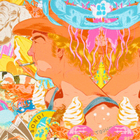 Fair Suck of the Pineapple A3
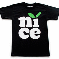 N.i.c.e Classic T
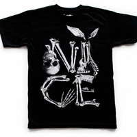 Skill and Bones Nice Remix
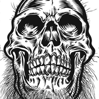 Skull
Skull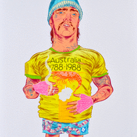 Archie A3